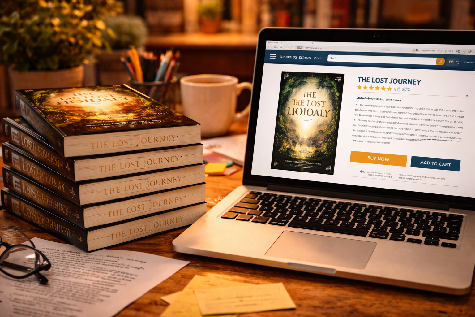
A book cover is often the first thing readers notice. Before someone reads the description or flips through the pages, the cover creates an immediate impression.
An effective book cover communicates the genre, tone, and theme of the book. For example, a thriller cover might use darker colors and bold typography, while a romance novel might feature softer tones and elegant fonts.
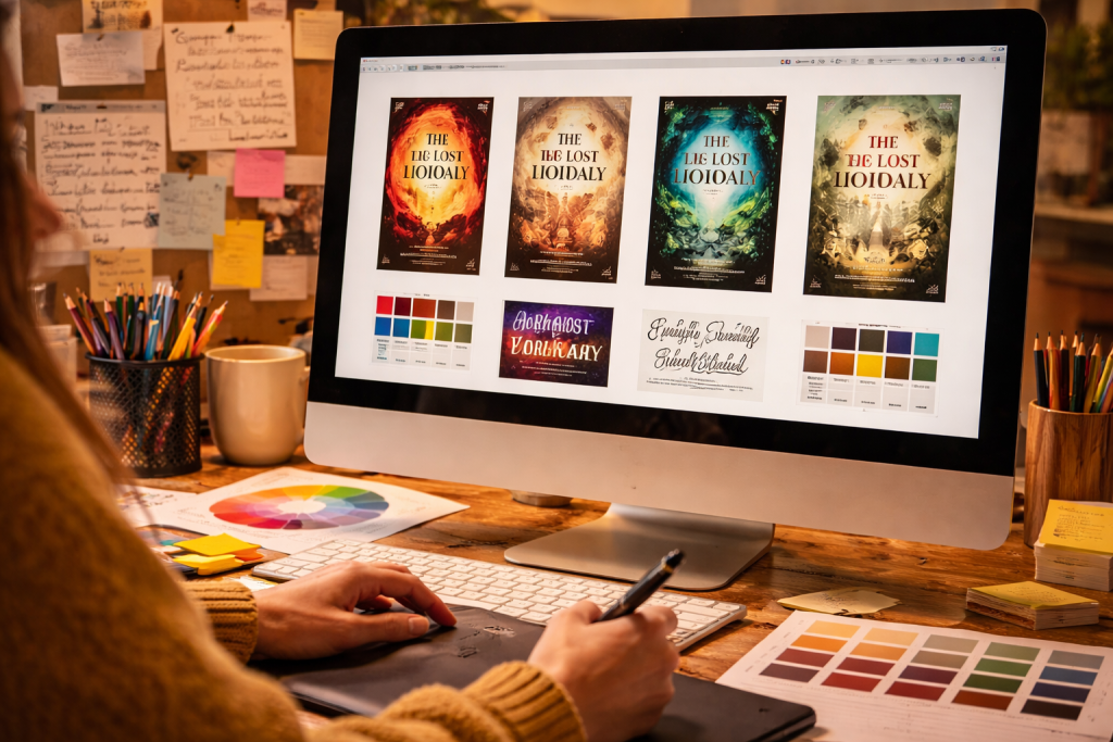
Professional cover designers understand how to combine visual elements to create an attractive and meaningful design. They consider typography, color schemes, imagery, and layout to produce a cover that captures attention.
Typography plays a major role in cover design. The choice of font can influence how readers perceive the book. Serif fonts often convey tradition and elegance, while sans-serif fonts may feel modern and clean.
Color psychology also affects how readers interpret a cover. Different colors evoke different emotions. Warm colors like red and orange can create excitement, while cooler colors like blue and green can create calmness and trust.
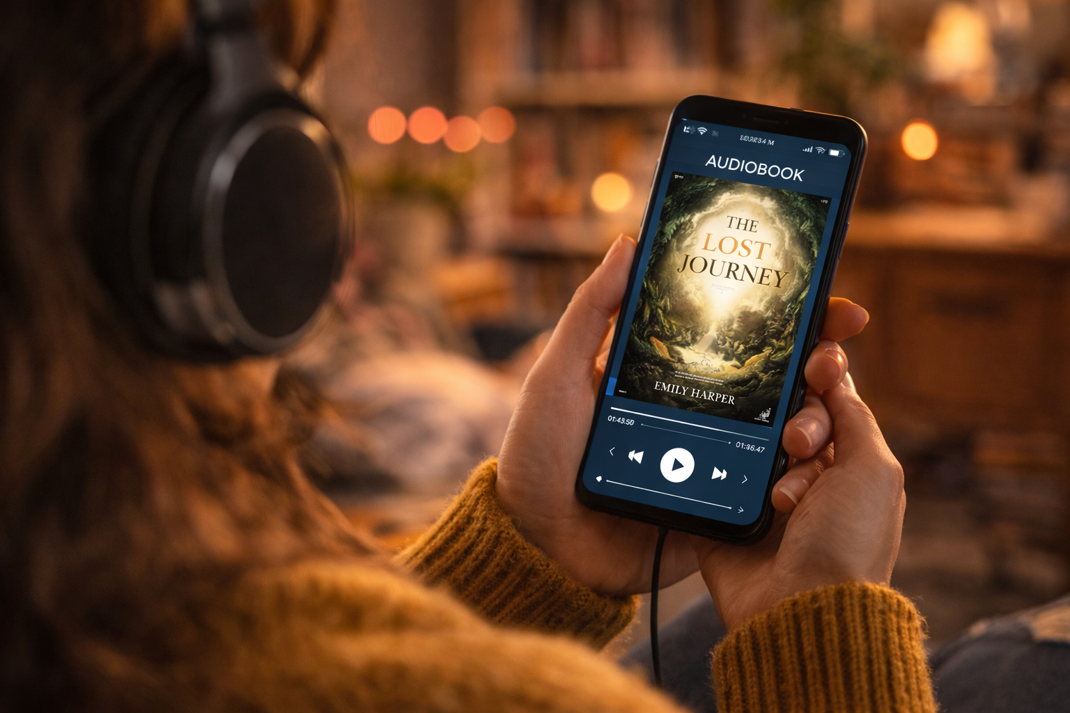
A well-designed cover also ensures readability in digital marketplaces. Many readers discover books through online stores, where covers appear as small thumbnails. Designers must ensure the title and imagery remain clear even at smaller sizes.
The goal of a book cover is not just to look attractive but also to attract the right audience. When a cover aligns with the expectations of a specific genre, readers are more likely to pick up the book.
For authors, investing in professional cover design can significantly influence how their book is perceived in the marketplace.